Ellsworth Kelly: Volume I
Anyone leafing through the pages of this volume cannot but be struck not only by the pace at which the artist’s production evolved during this early period of his career but also by its diversity—with the exception perhaps of the paintings he produced as a student during his brief attendance at the Boston Museum School, prior to his departure for France. This diversity is the main reason many of the works examined in this volume are discussed at such length and in such detail: in almost every case, the particular question the artist was addressing, and the formal solution he devised for it, was entirely novel to him. Furthermore, no sooner had he resolved a problem than unexpected avenues of inquiry emerged from that very success and new questions appeared. The letters he writes to friends during this period are replete with complaints about not having enough time to realize in painting all his final studies, many of them neat collages that would linger in drawers awaiting a quieter time. That lull never came while he was overseas. The sketchbooks Kelly filled during his sojourn in France are a mine of brilliant ideas in draft form (especially for reliefs), so numerous that several lifetimes would not suffice to bring them to fruition.—Yve-Alain Bois in Ellsworth Kelly: Catalogue Raisonné of Paintings, Reliefs, and Sculpture: Volume I, 1940–1953
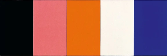
Ellsworth Kelly likes to recall the incident in which a child, pointing at the five panels of Painting for a White Wall, enumerated their colors from left to right and back. It was at this moment that the artist realized that what he had wanted to do in this painting was to “name” colors.
The idea that a juxtaposition of color rectangles was the visual equivalent of a suite of color names had two components, both related to an essential property of language, namely its infinite permutational capability. When the child enumerated the colors of Painting for a White Wall in both directions, he produced a permutation on what linguists call the syntagmatic level (in an enumeration, to take the example of the child’s utterance, the sequencing of the terms is of no grammatical consequence: “black, rose, orange, white, blue” is as correct grammatically as “blue, white, rose, orange, black”—or, for that matter, “blue, rose, black, orange, white,” or whatever word order). Investigating this aspect of the comparison between colors and linguistic units is what the artist set out to do in Red Yellow Blue White and Black, Red Yellow Blue White and Black II, and Red Yellow Blue White and Black with White Border.
The second aspect of the comparison concerns permutation on what linguists call the paradigmatic level: on this level, it is not a matter of changing the position of a given term within a set sequence but it involves the potential for replacing any term in the set sequence with another absent term that fits the same grammatical criteria. In “black, rose, orange, white, blue,” to take the example of the child’s utterance again, the word “black” could be replaced by the word “gray,” the word “rose” by the word “purple,” orange by red, white by yellow, blue by green—but any other set of color names would do just as well. Just as well, that is, in grammatical terms, although not semantically, each name having its own connotations. And when we switch from the names of colors to colors per se, to Kelly’s monochrome panels, this semantic uniqueness is even more acutely felt: each color, each nuance or gradation of each color, has its own character. True, colors never cease to interact, and as Josef Albers was fond of demonstrating, a particular color can be made to look, through interaction with other neighboring colors, like two utterly different ones, or two different colors can be made to look like one, but such tricks, which nature plays on us from time to time, can only be intentionally performed in full knowledge of the specific, differential character of the individual colors at play. That each color is absolutely singular, as singular a proper name, is the intuition that had guided Kelly as he was working on Painting for a White Wall, and it was paradoxically confirmed by the child’s mistake in naming that painting’s leftmost panel (which is dark blue, not black). This intuition emanates from a nominalist conception of art that pervades Kelly’s whole oeuvre, from his first transfers onward (he effectively declares that there are no universals when he excerpts a flat pattern from the world at large and transcribes it as such in a painting or relief: what captured his fancy is the shape and proportions of that particular seaweed, of that window, of that flagstone arrangement, and it is this that he wanted to record as precisely as possible). It is this same intuition as well that he decided to explore in greater detail when he undertook Spectrum I.
But if one wants to investigate the infinite realm of colors, where should one begin? Just as a child had helped him pinpoint the underlying impulse behind Painting for a White Wall (that of naming colors), a detour via the enchanted world of childhood provided Kelly with his point of entry. One starts indeed with naming, and more exactly with the naming of the colors of the rainbow (from which pink is absent)—that is, with Roy G. Biv. Or rather, with its modern revision, which got rid of the indigo that Isaac Newton had included in his chromatic circle in order to obtain (for totally unscientific reasons) a total of seven colors. (Unlike scientists who felt they needed to stick by Newton, especially after Goethe had lambasted his Optics, painters were quick to object.) Among artists at least, the twelve-color chromatic circle most frequently in use today was already well established in Europe and particularly in France by the end of the nineteenth centur—favored in fact by all painters, from academic followers of Ingres to the most radical members of the avant-garde. The elegant simplicity of the duodecachromatic circle, with its facing off of primaries and secondaries, is what made it so successful. It is no surprise that Kelly, then based in France, would have reached for this standard color wheel as a prop for his attempt at mapping the spectrum.
It should be noted, however, that in doing so he was departing from the color theory he had been fed as a student, which was based on the elaborate system conceived in Boston at the beginning of the twentieth century by Albert Munsell. Taught in American art schools and still in use today in many sectors of American industry, this system is based on a chromatic circle that comprises ten instead of twelve hues and in which green and purple are added to red/yellow/blue as principal hues. Kelly vividly remembers the color exercises he was assigned in his classes at the Pratt Institute, in 1941–42, which required him to fill up ten “Munsell student charts,” one per hue, by pasting on them small cutouts of colored paper in sequential progressions of value (from light to dark) and saturation (from minimum to maximum chroma). He still possesses these charts, which have lost some of their original pasted cutouts. Leafing through them recently, he observed: “It is the first time that I realized that I preferred all the spectrum colors in their strongest chroma position, and the strongest chroma color has guided my color selections for all my works ever since.” Given Munsell’s goal of codifying every possible gradation of any hue, of identifying in excruciating detail every minute difference in value and saturation, which involved the manipulation of many toned-down shades, these exercises would not have been of much value in helping Kelly elaborate his spectrum sequence. Full saturation was the least of Munsell’s concerns, and he certainly did not want to name colors (his whole system of notation was in fact conceived as a possible substitute to color nomination)—which is to say, at this particular juncture of Kelly’s pursuit, Munsell could hardly have been the best guide. Only one extra chart, had the artist only had his Munsell kit with him in Paris, could have been helpful (and it is possible that, at lease unconsciously, he remembered it). Concerning the concepts of value, chroma, and hue in general, this eleventh chart sports both a chromatic circle and, at the top, a horizontal spectrum in “ten hues at maximum chroma,” which begins at left with yellow, like Spectrum I (but, unlike Kelly’s painting, ends at right with orange).
The only preparatory work for Spectrum I is a collage (there is no other sketch of any sort). It is made with the same papier gommette that Kelly had used for most of his collages since falling in love with this semigloss material more than two years earlier. Out of the twenty or so colors in which it was available, he chose the twelve that came closest to the hues of the color wheel. From them he cut thirteen long strips: two identical yellow ones, as this color appears at each end of his rendition of the spectrum (cartographers use the same looping device when they draw a planisphere), and one for each of the other eleven colors. Needless to say, Kelly knew full well, when he glued these strips of colored paper together, that the result would only be an approximation of the spectrum, for it was obvious that quite a few of the colors offered by the manufacturer of the gummed paper were not fully saturated (to use the artist’s expression, they were “out of chroma”). But this offered enough encouragement to pursue the experiment, even if it meant breaking a rule he had followed in his previous works based on papier gommette collages, which was to match the hues of the material when translating them into paint. Paint can be mixed, so the matter of adjusting the color of each band in such a way that the intervals of hue and value between each strips would be equal did not seem so elusive a task (progressing symmetrically from the brightest color on both sides, yellow, to the darkest one in the center, purple or violet).
To Kelly’s astonishment, he hit a snag, with the central color in particular. The purple was coming out too dark, so in order to brighten it he mixed in some white, but this “grayed” it, as he says. Intervals gave him all kinds of problems. He had thought that adding a supplementary shade of yellow would help (the canvas has one more stripe than the collage, with two different yellows on the right side), but it did nothing of the sort. The fact is that he was after the grail, trying to keep intact the identity of each color (naming it) while stringing them all together. Even an Albers, who has spent his life experimenting with color interaction, will admit that if obtaining regular intervals of value on a single field is complicated but not out of reach, it is much more difficult to achieve the same goal with regard to saturation and downright impossible with regard to hue, which is why not a single exercise of his celebrated color course dealt directly with this last conundrum. The reason for this impossibility is precisely that the regularity of intervals is constantly skewed by color interaction, and monitoring all the effects of this interaction (which, on top of everything, is subject to the slightest modification of lighting conditions) is above human capacity when many hues are simultaneously employed in a field-particularly when, as in the case of the duodecachromatic circle, they are at maximum saturation. Two other optical effects, unplanned by Kelly, are also caused by color interaction: the fluting effect that makes each band look concave, like the grooves of a Doric column, and the ghostly X that spans the whole surface of the painting, starting from each corner and crossing in the middle.
Kelly was never satisfied with Spectrum I and always considered the work unfinished. Part of its “failure,” he thought at the time, had to do with the fact that he had not conceived it as a multipanel painting (thus disobeying the rule of “one color per panel” that he had formulated in Colors for a Large Wall and had adhered to almost exclusively since). When he tackled the spectrum puzzle again in the late 1960s (making five more Spectrum paintings between 1966 and 1969), he did so in the multipanel format and at a mural scale so that at least some of the effects of color interaction would be easier to control and adjust, even almost entirely suppressed in the two cases where the panels are separated on the wall rather than juxtaposed (Spectrum V and Spectrum VI, both of 1969). As usual with Kelly, however, disappointment yielded further investigation: realizing during the process of working on Spectrum I that he had a lot to learn about color behavior, he decided to forgo the rainbow and learn empirically by trial and error. His first move would be, in Tiger, to revisit the strange orange/pink that had been so essential to his understanding of what he had achieved in Painting for a White Wall. After that, revisiting an even (much) earlier work, he would endeavor to test a multitude of color interactions by realizing in paint a collage of his Spectrum Colors Arranged by Chance, which he had made in 1951 but left unattended since then.